
Brand Identity
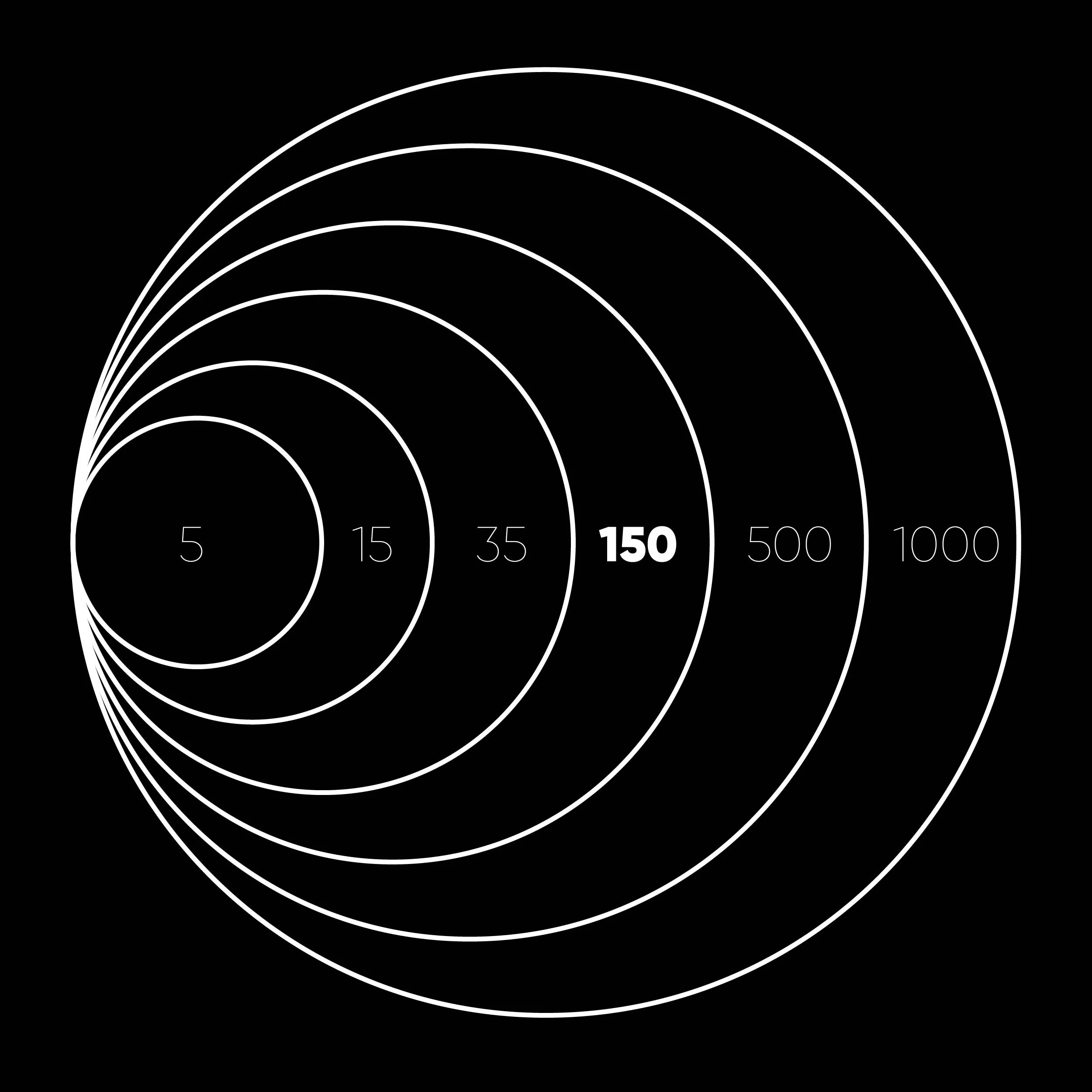
District 150
The Future of Work is no longer Business as Usual.
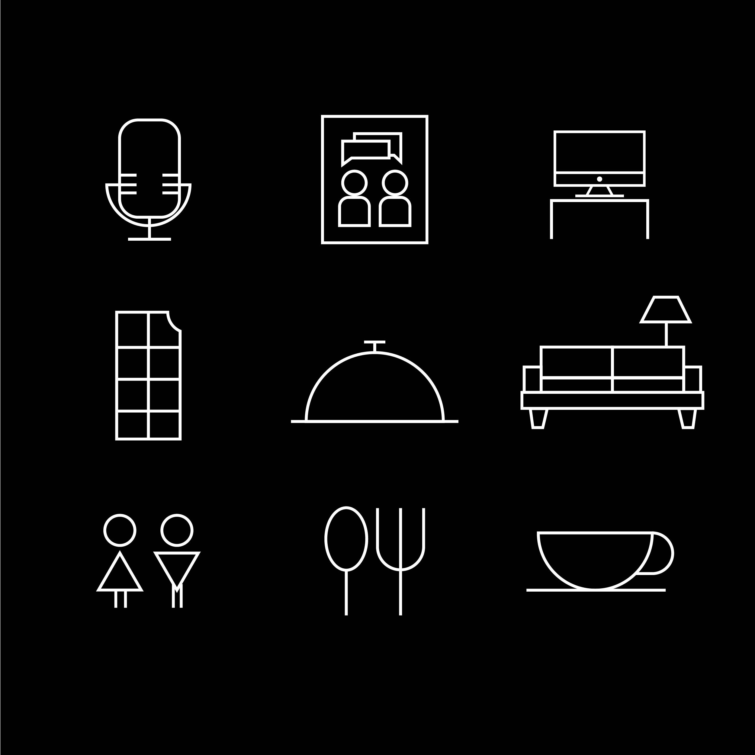
The office of tomorrow needs areas for head-down work like a library, collaborative spaces, social spaces, space for board meetings and town halls, all integrated, under one roof. district150 is a lifestyle focused, hospitality powered, multi-purpose meetings and events hub that serves as a core amenity for the office building of tomorrow.

The brand draws its inspiration from the theory posited by anthropologist, Robin Dunbar, an evolutionary psychologist. Dunbar’s Number (150) is a suggested cognitive limit to the number of people with whom one can maintain stable social relationships.


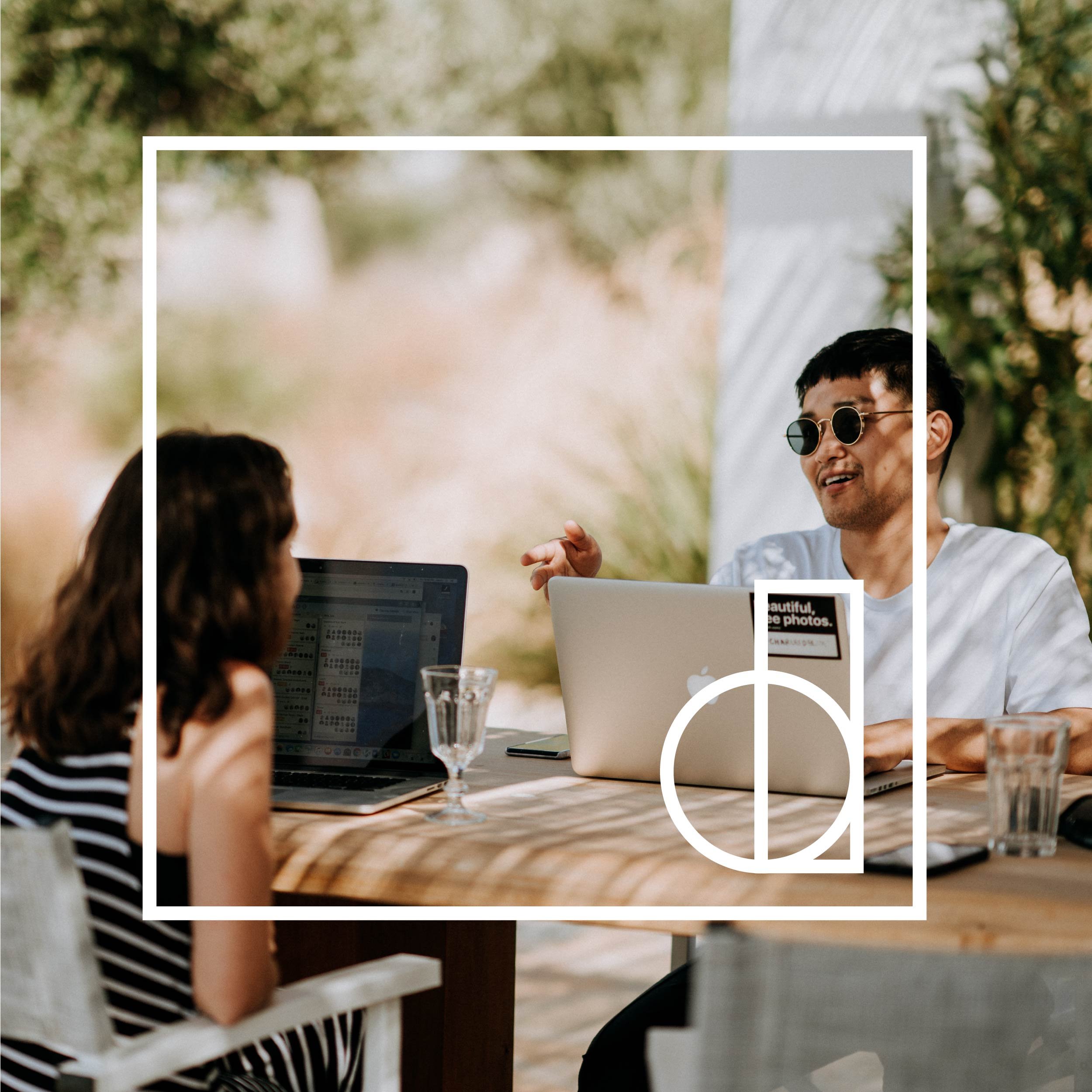
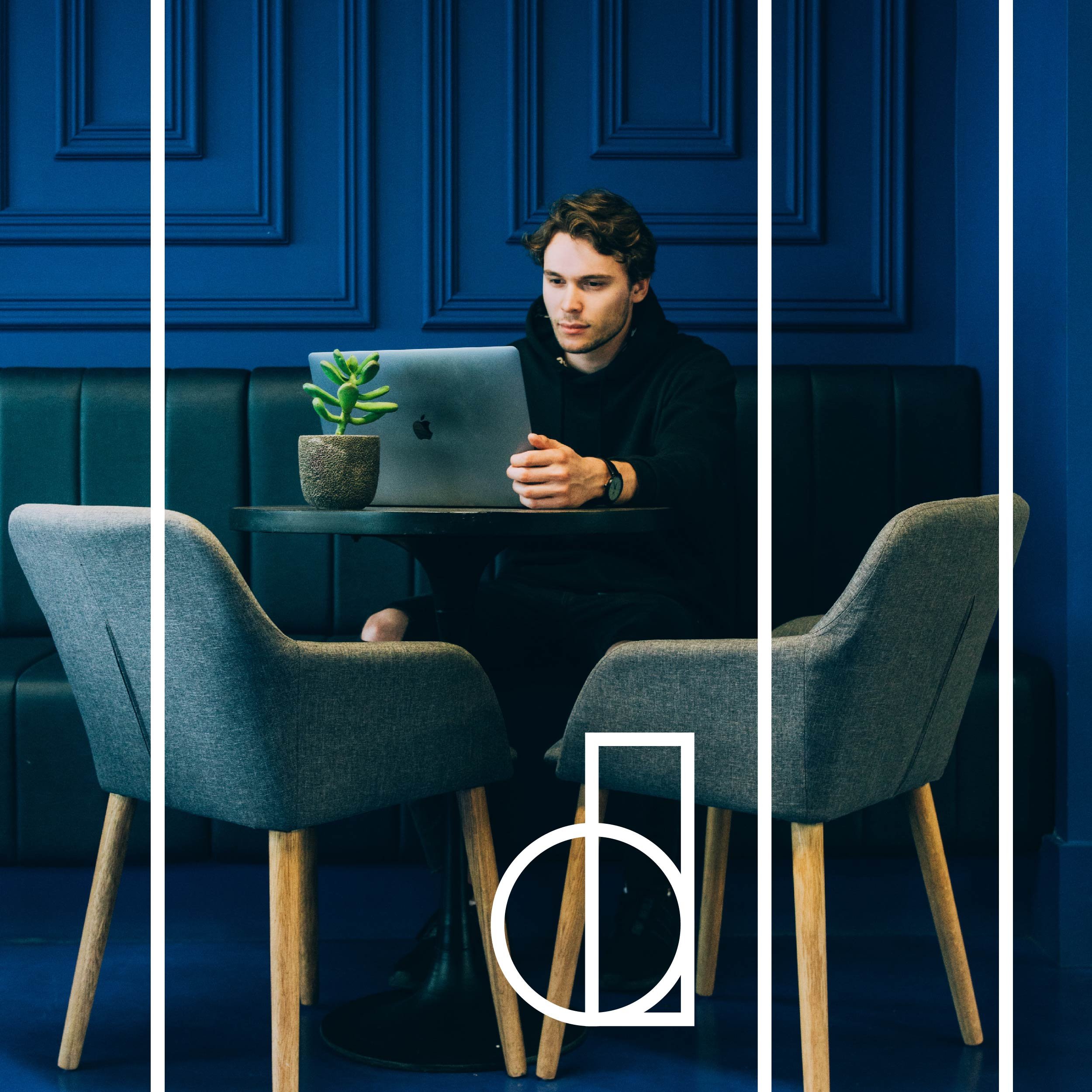
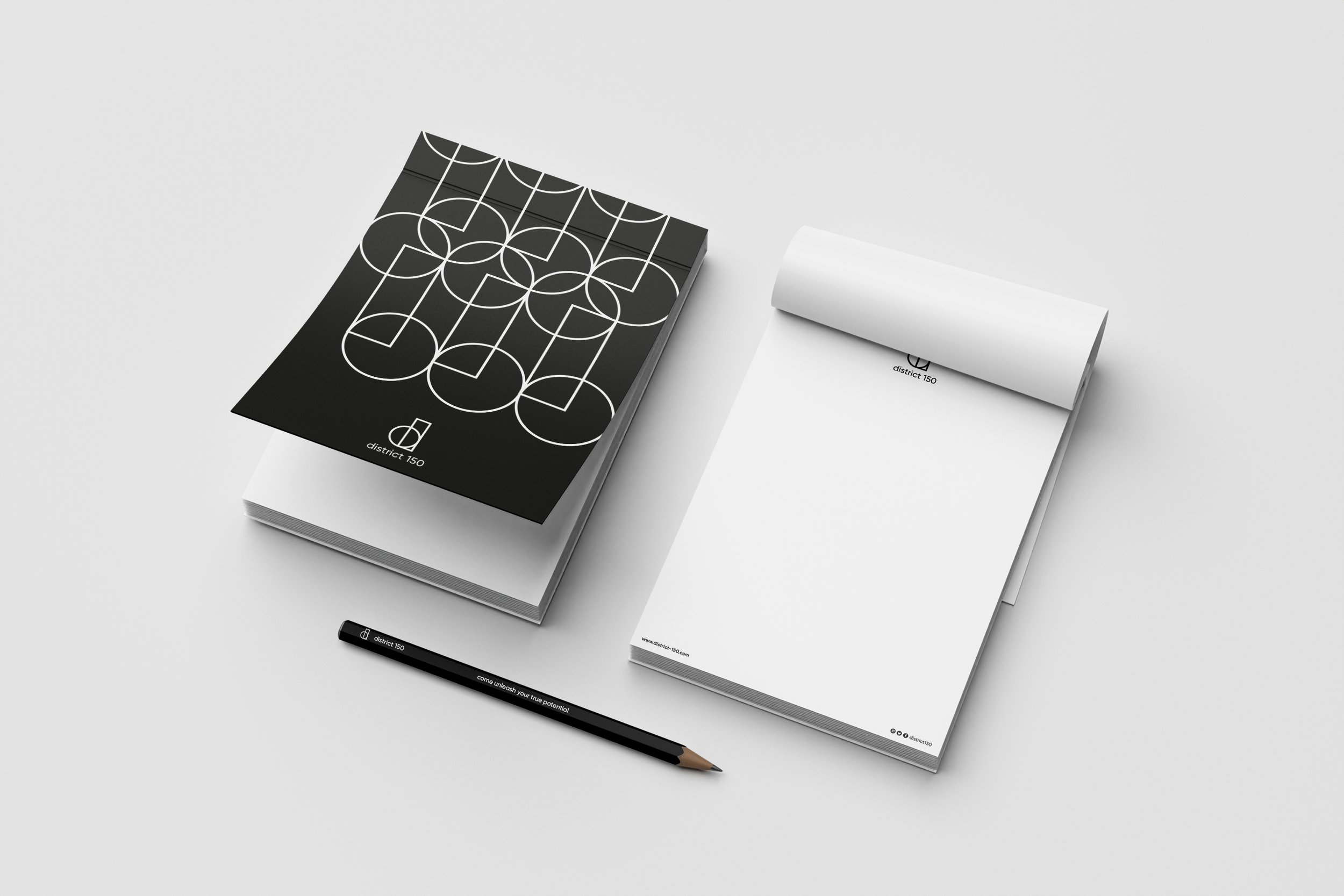
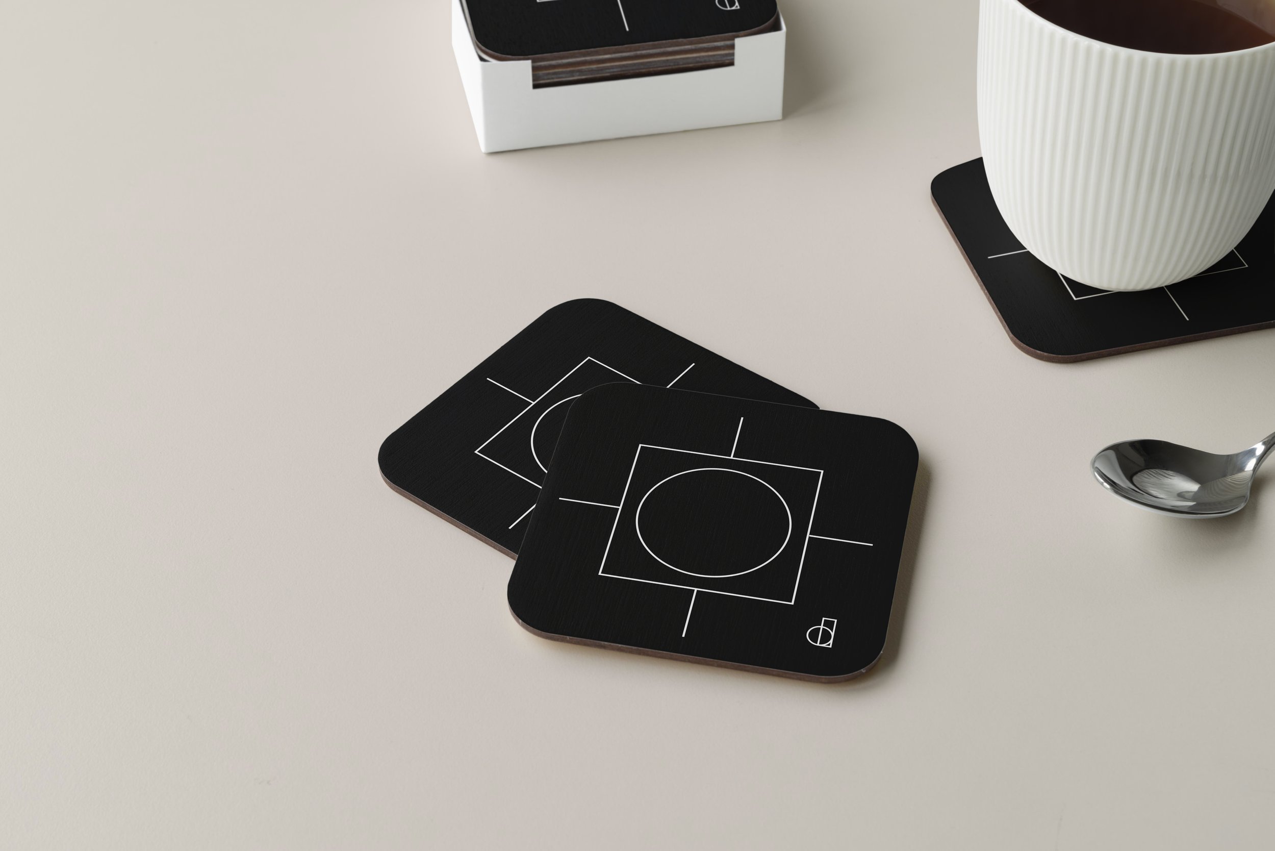
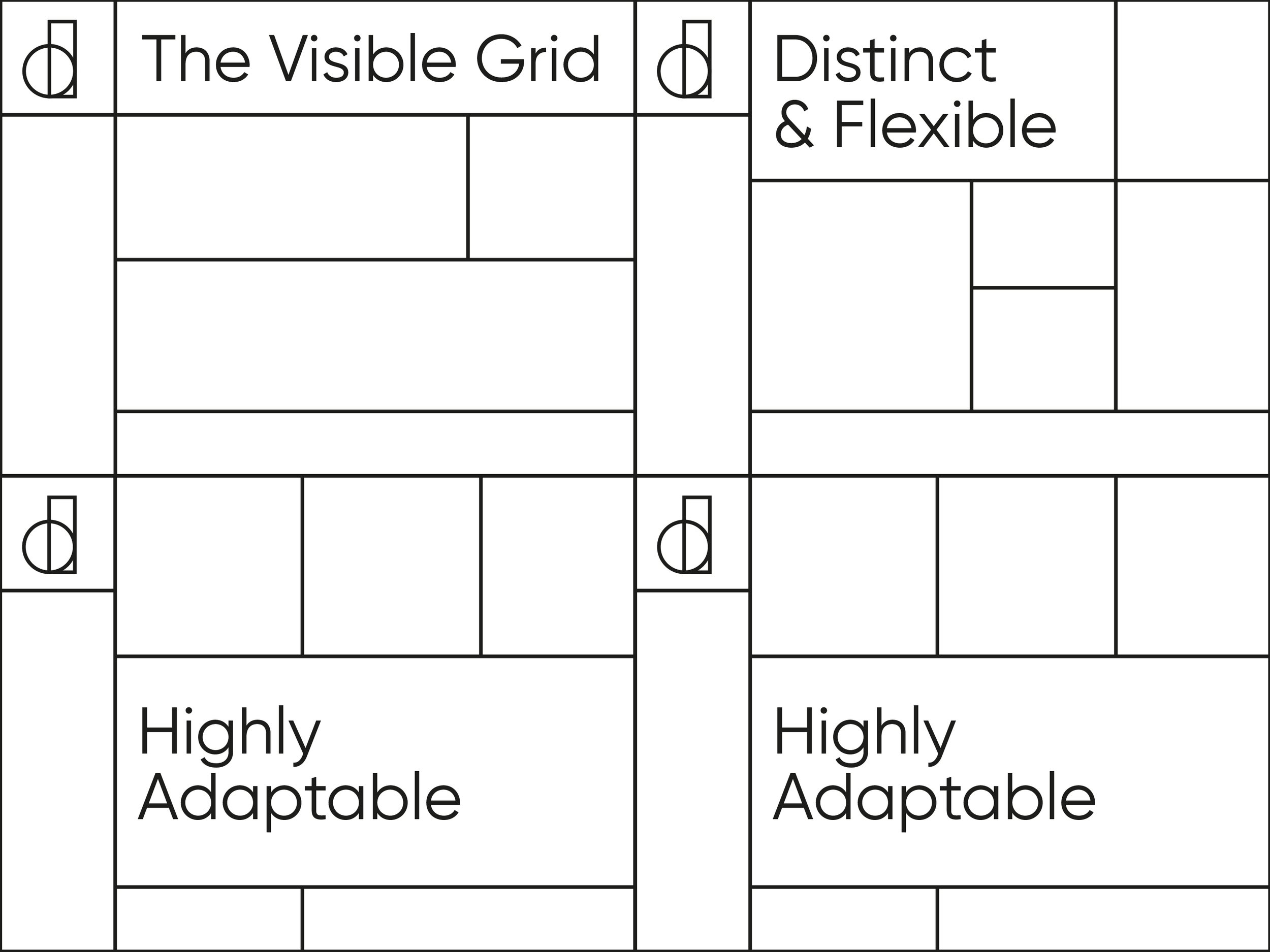
The identity was based on a stylised lower case d. It also combines the 1 & 0 - signalling the deep tech integration that it has built in its spaces. The interconnection between the parts symbolizes the network & connection between people that is at the core of our business. The symbol creates a consistent grid based visual language that allowed us to create a dynamic visual identity that is uniquely district150.
CULTURE | CONNECT | CHANGE by design
was developed as the organising principle for the brand
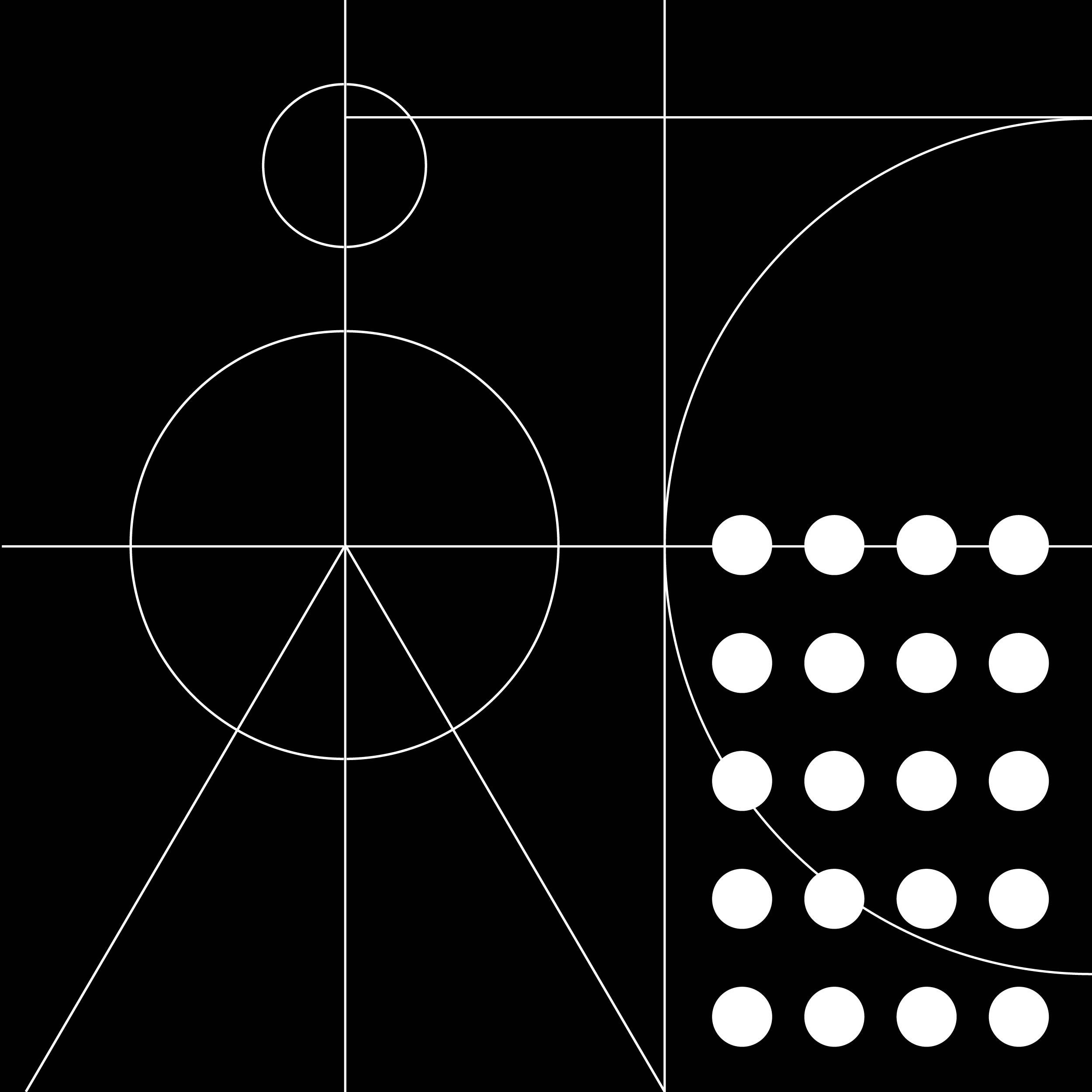

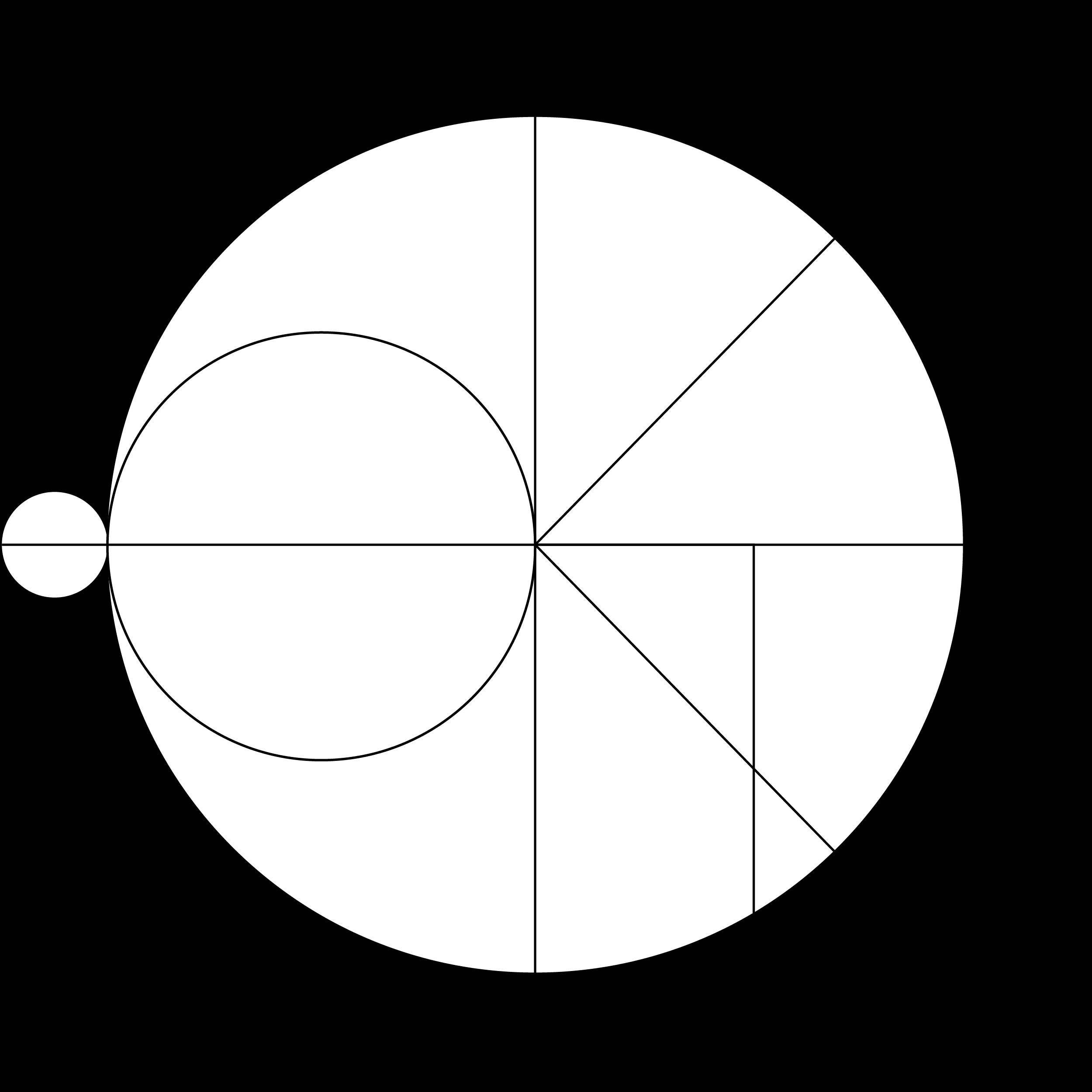
The design system was developed to extend the brand language, bringing consistency and clarity across all key brand touch points. The basic shapes from the D150 logo when extended across create a diverse visual vocabulary which allows the brand to use it across its various touch points - from social media to frosting patterns within the physical space.


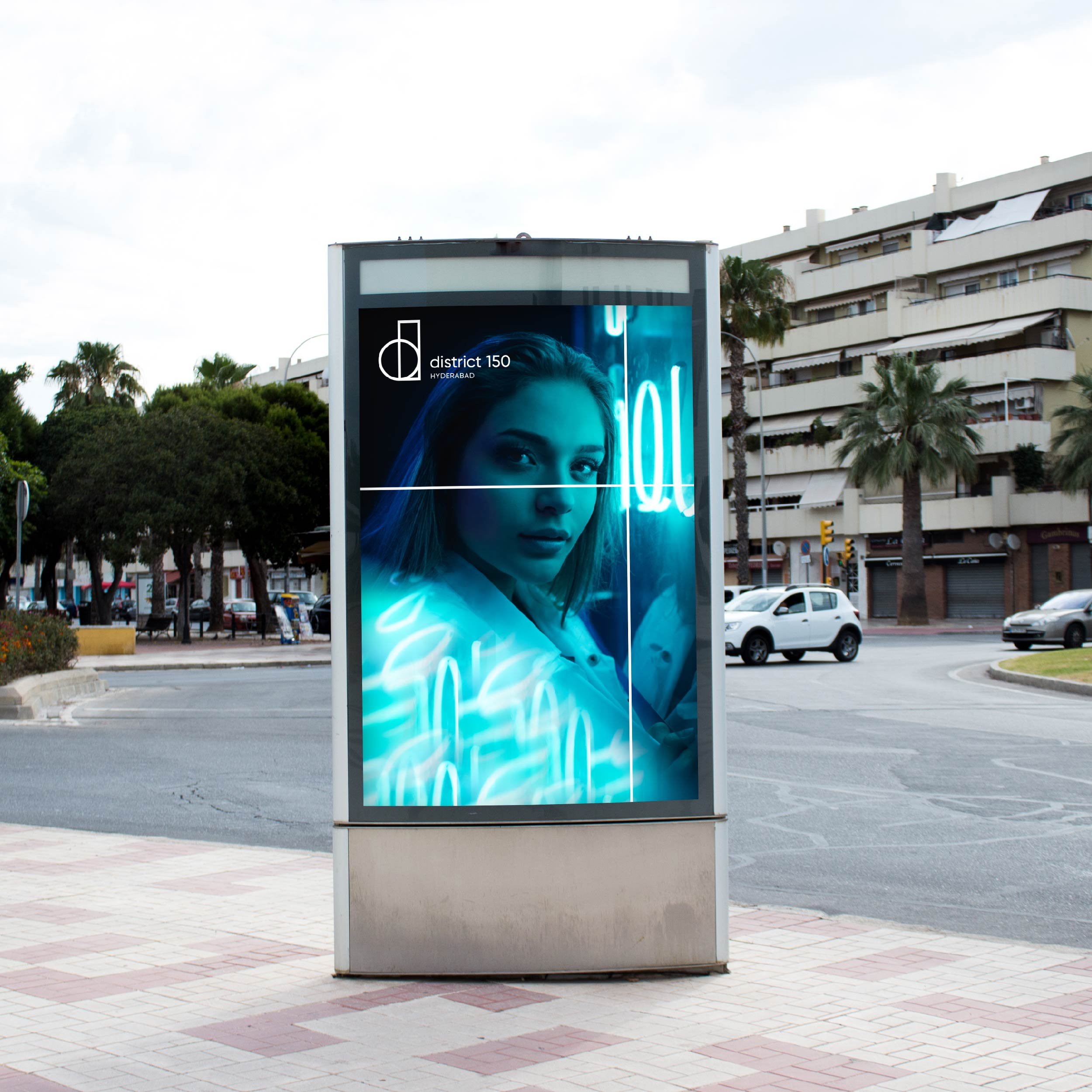
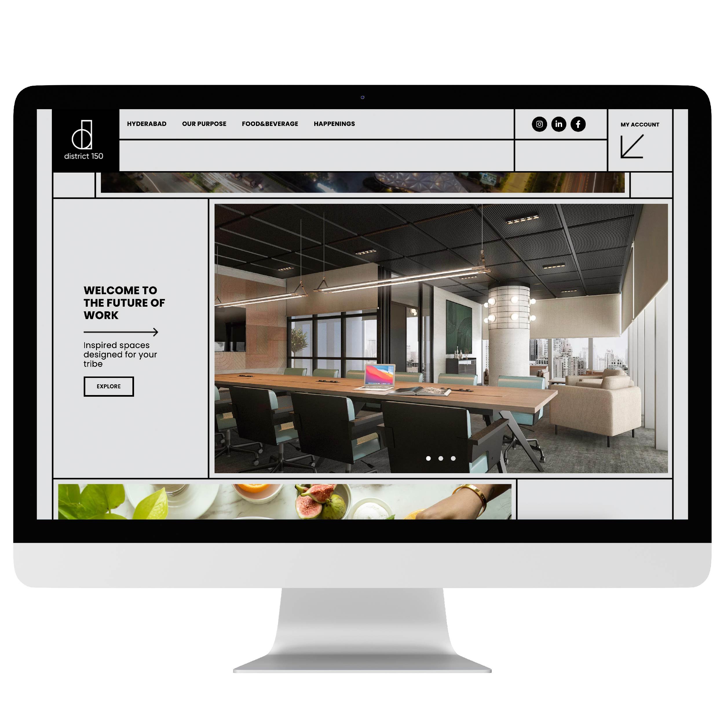
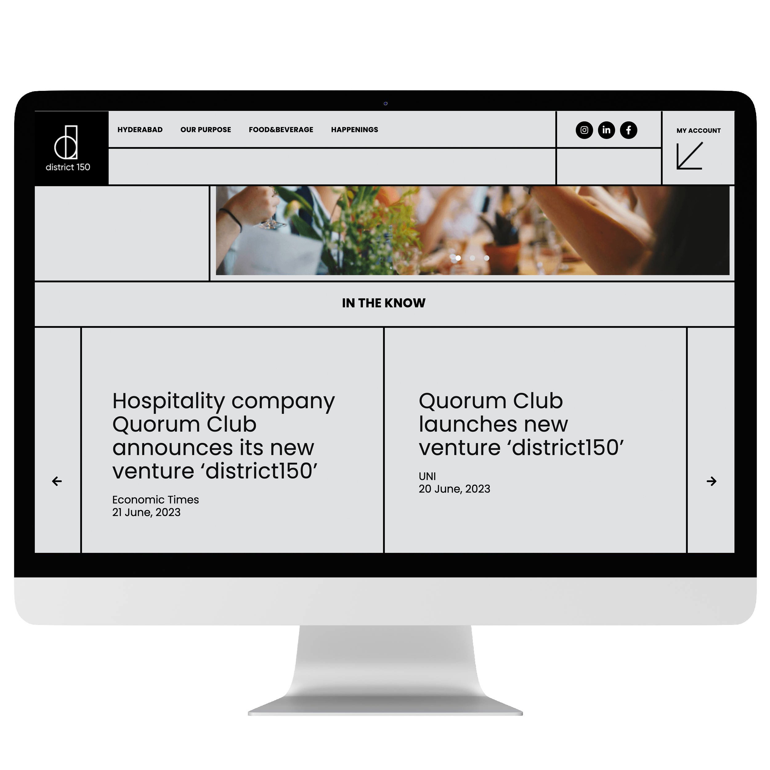
The brand website serves as its digital shopfront. The design system uses a visible grid to create a distinct look for the brand. The opportunity was to create a language that can tie in various functions and information together - from booking engine to showcasing the latest events. The website design ties in the brand language clearly.


The basic shapes derived from the symbol were expanded in motion to create a dynamism that reflects the energy of the physical space. A brand launch film was designed that brings together the idea and vision for the brand and expands on the visual vocabulary.


Credits
Design Team : Saurav Roy, Smita Sohoni, Aditi George, Nigel Gomes
Brand Film: Upasana Nattoji Roy
Client Team: Vivek Narain, Soniya Jehan, Nandita Iyer, Sanjna Yadav
Client: Quorum