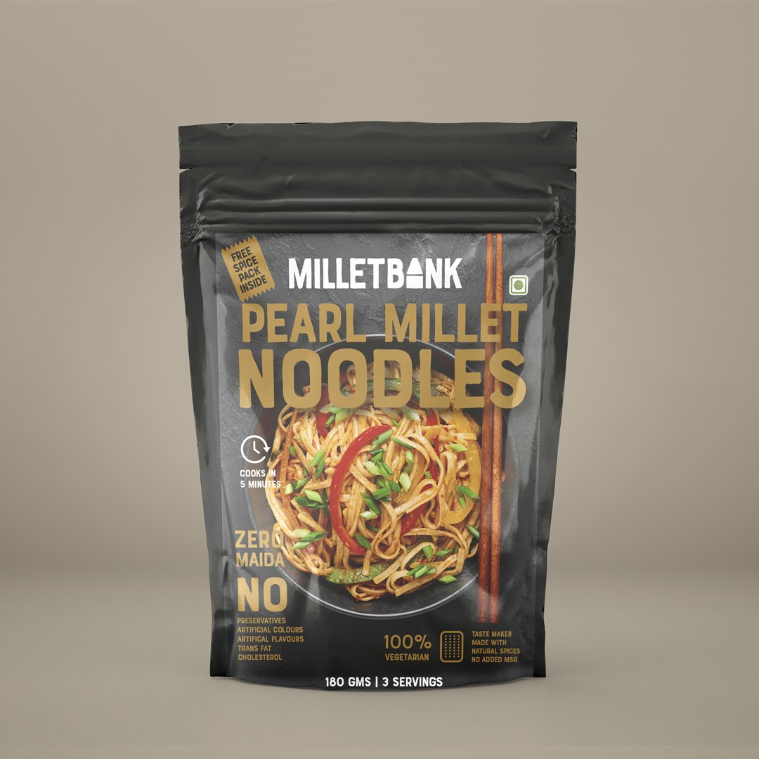
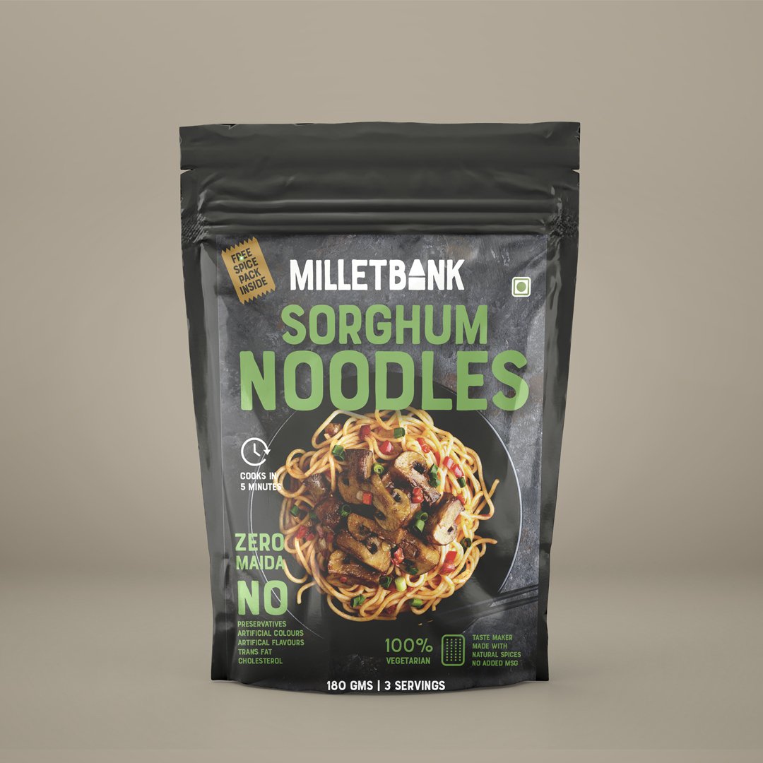
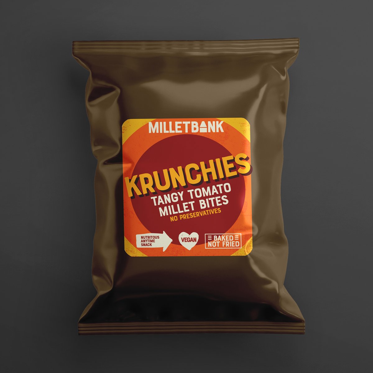
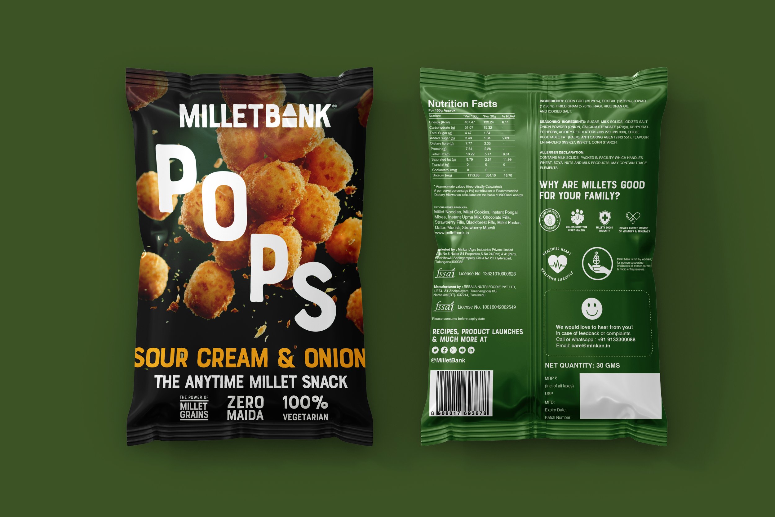
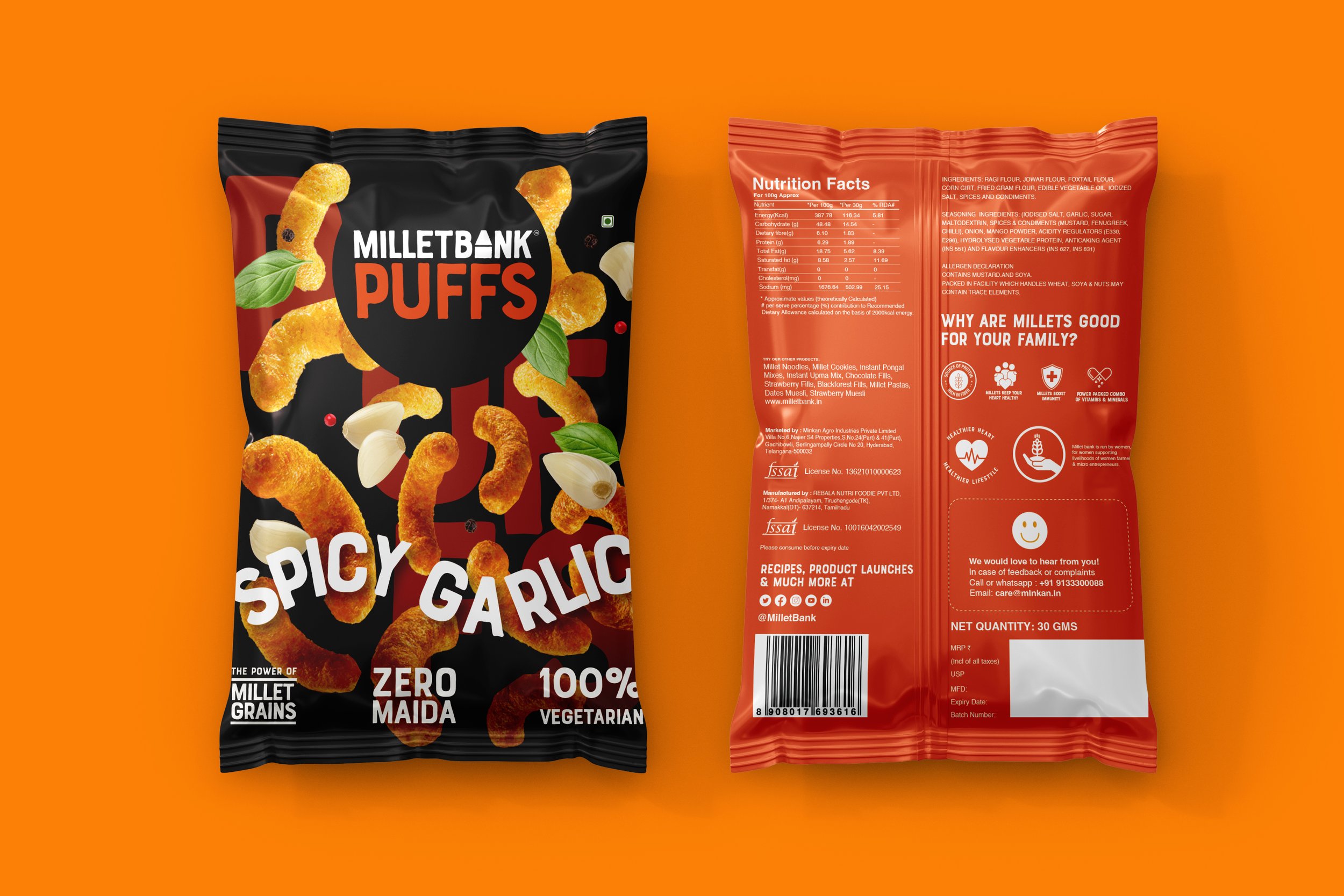
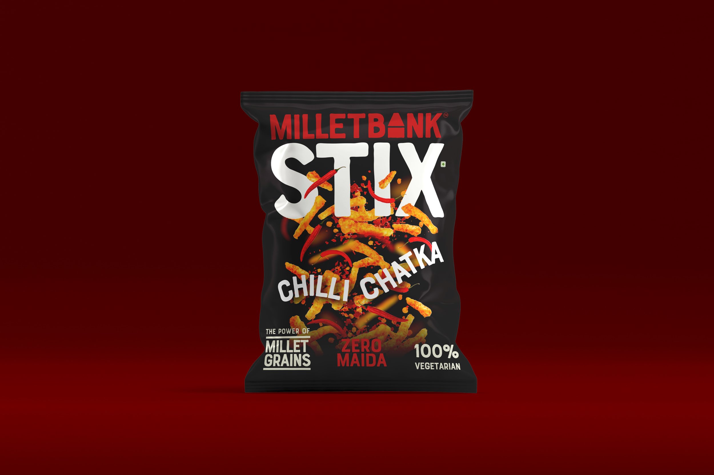
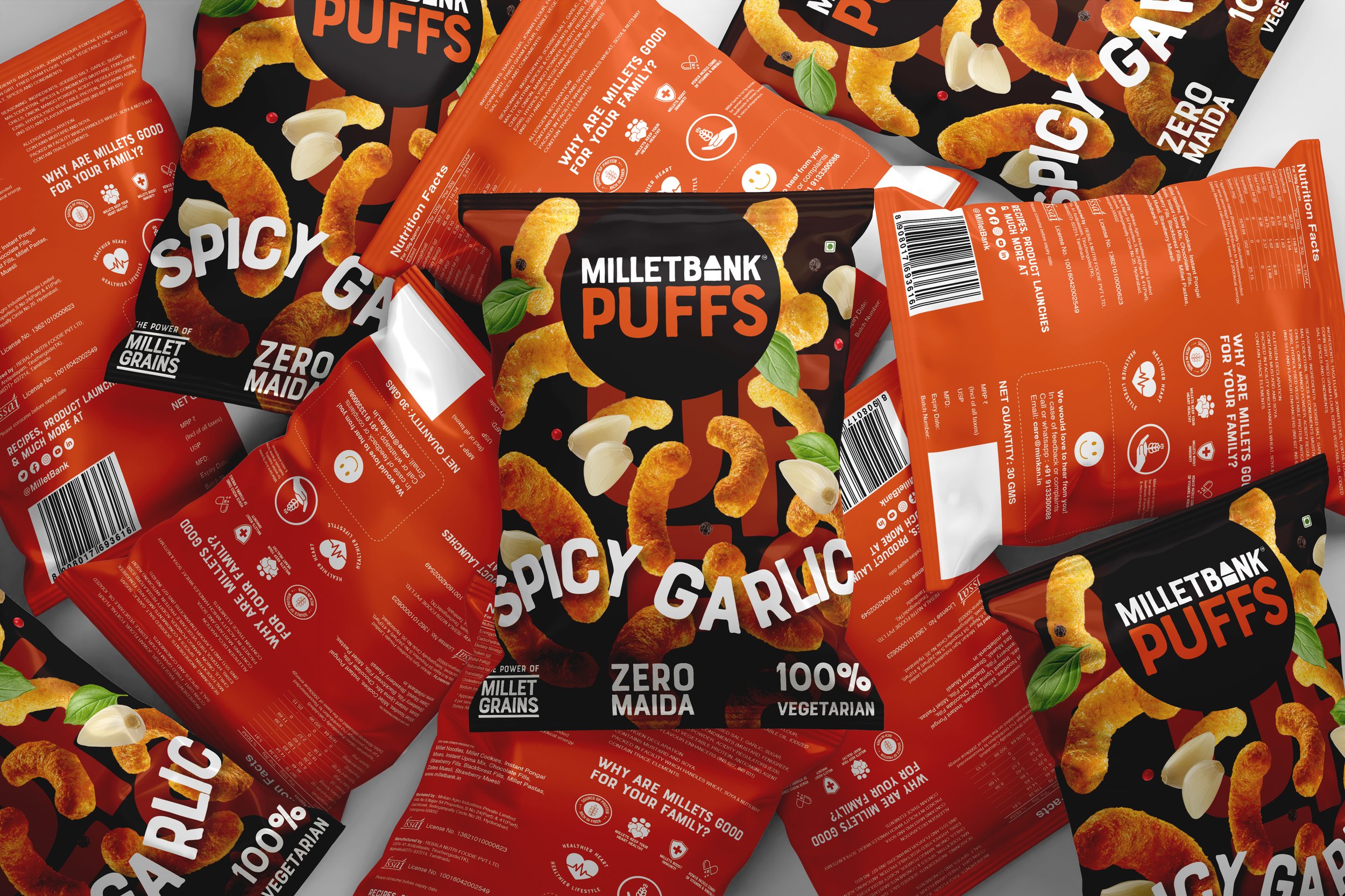
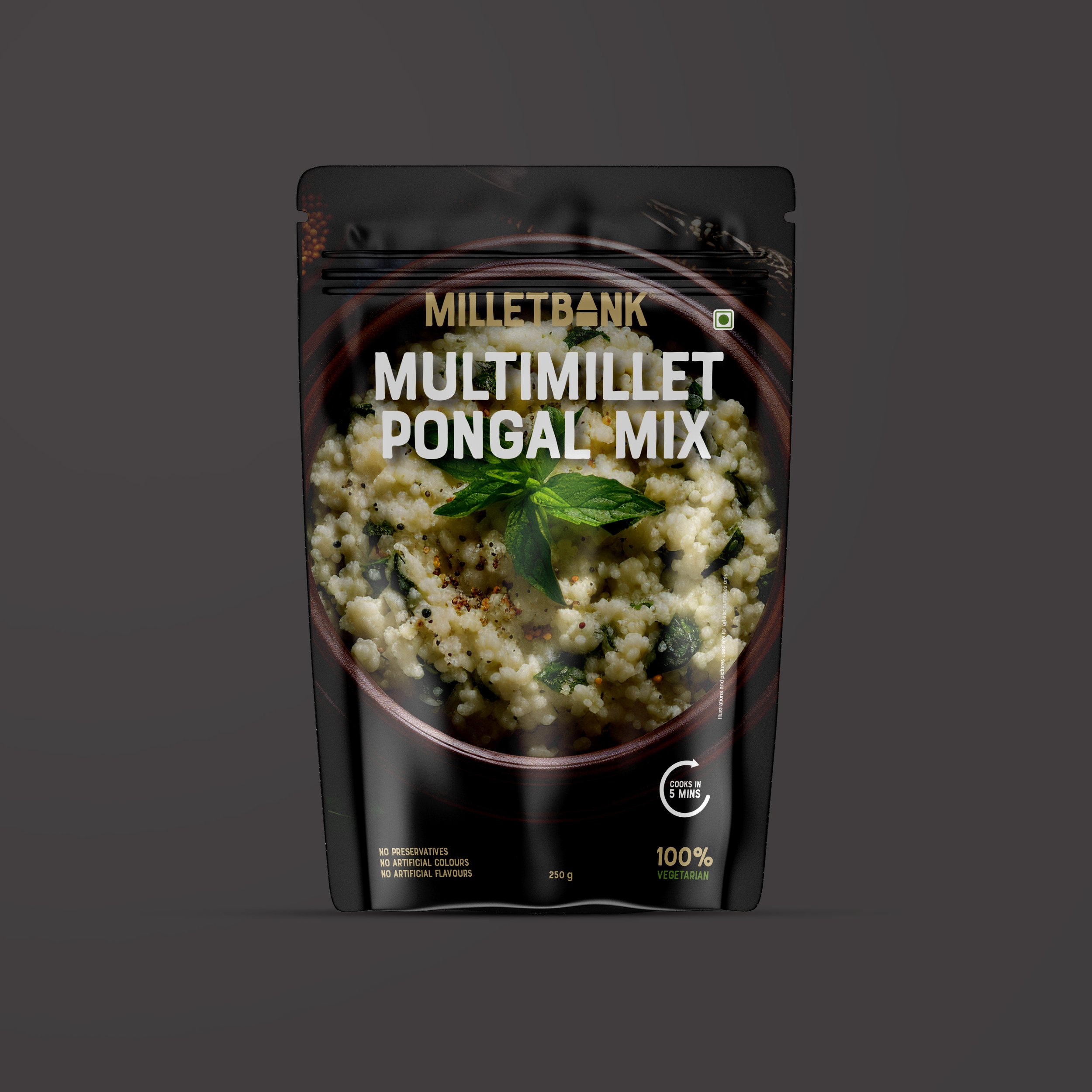
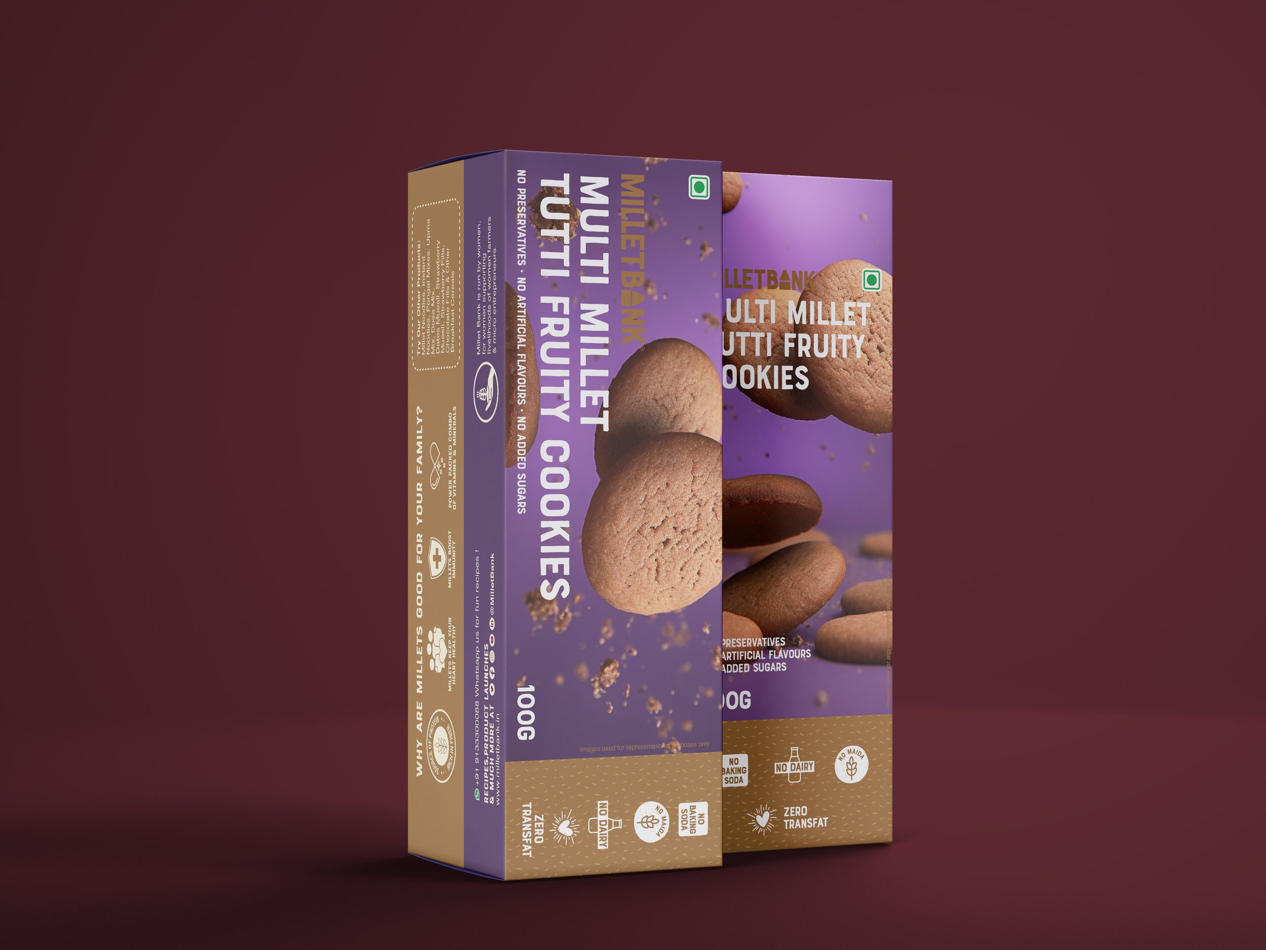
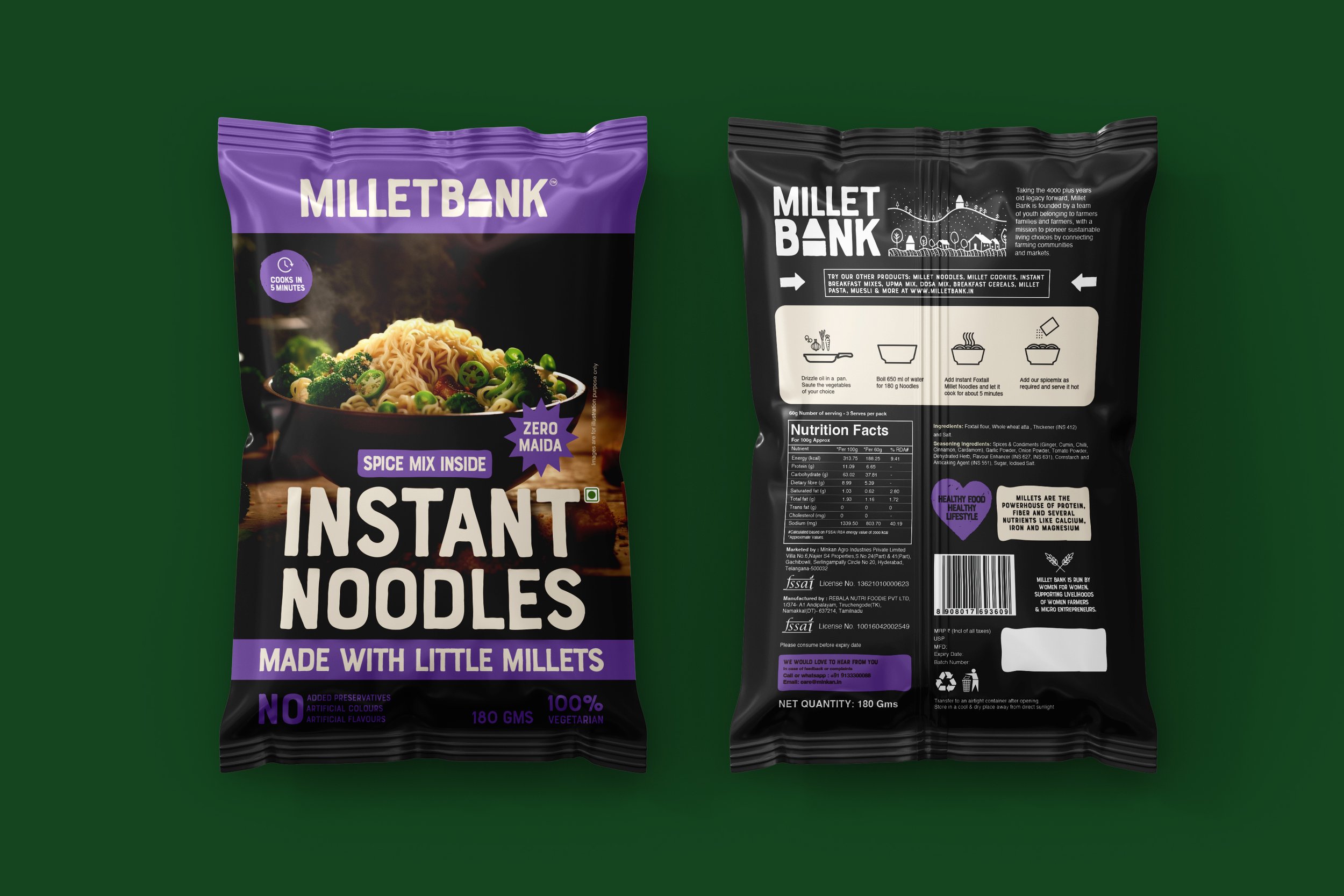
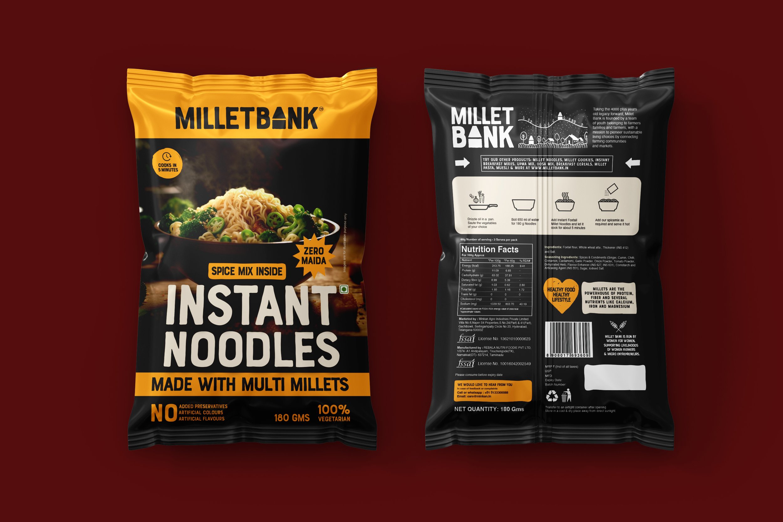
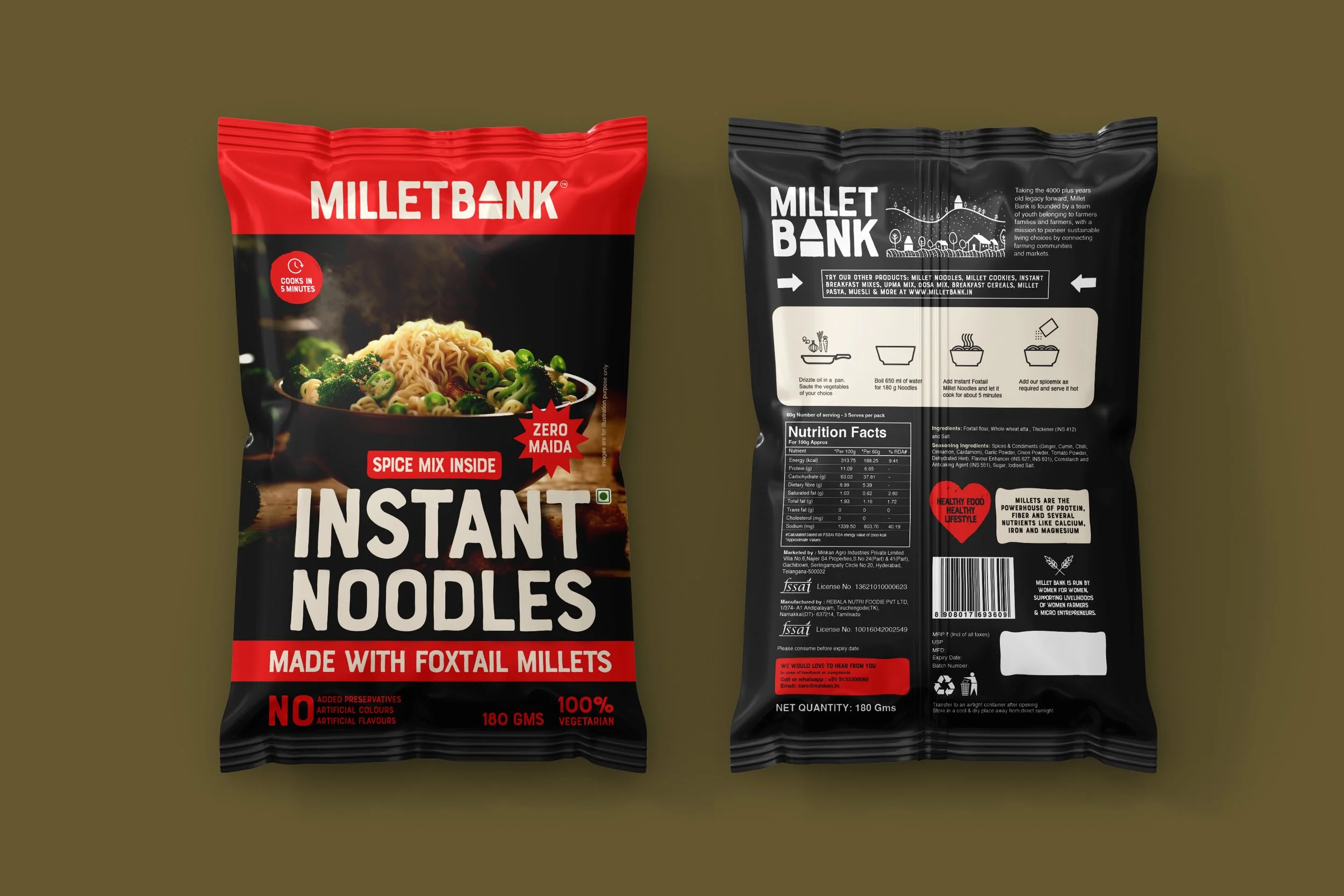
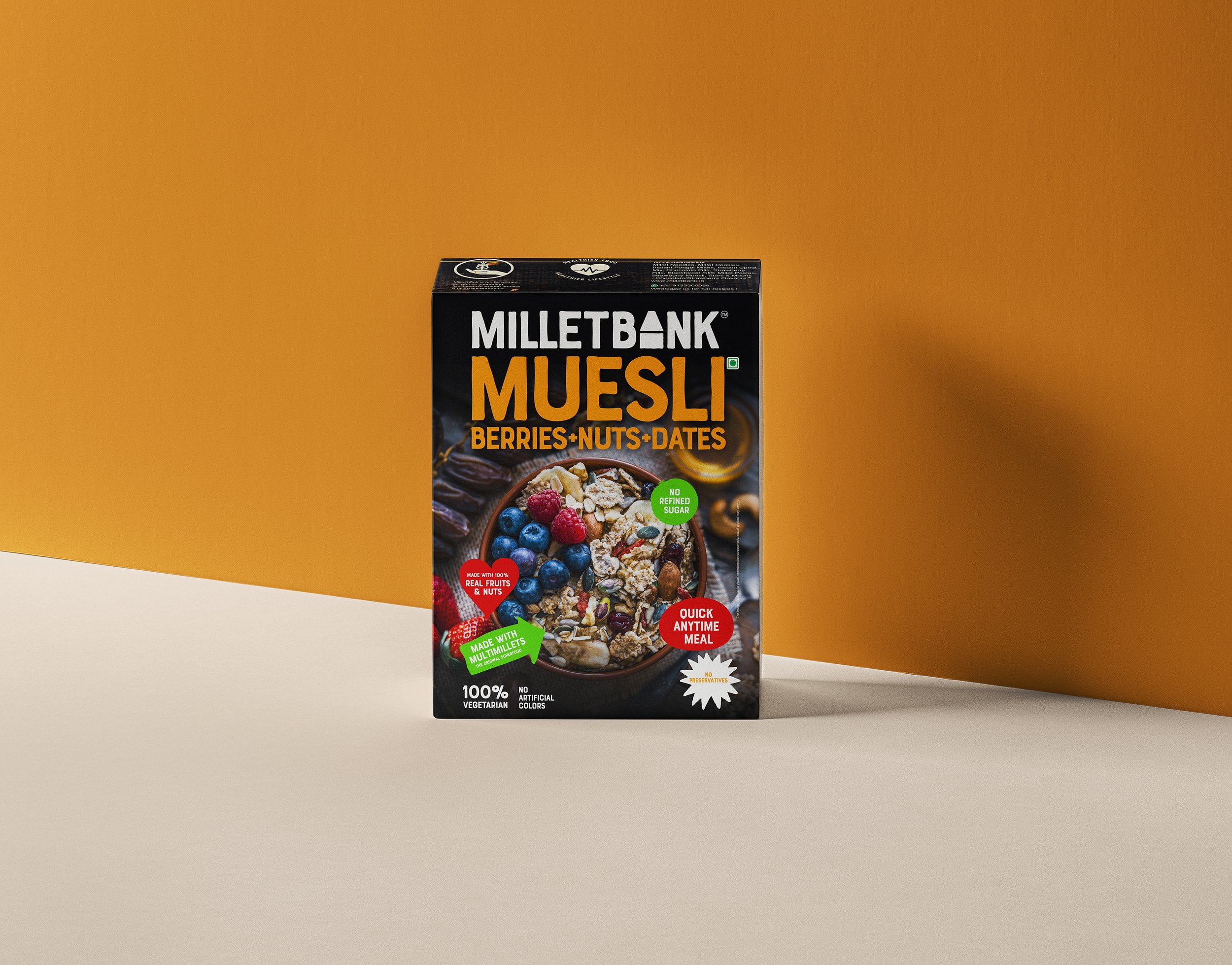
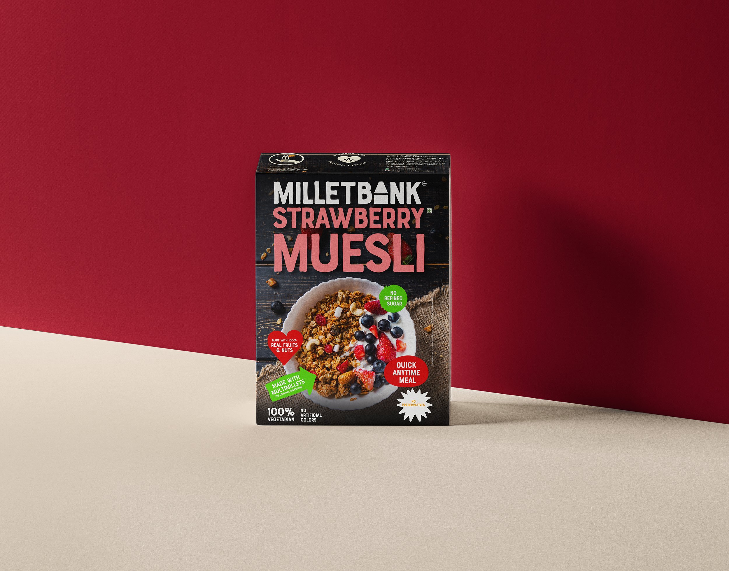
Brand Identity - Packaging
Millet Bank
Taking the 7000 plus years old millet farming legacy forward, Millet Bank is an initiative of a team of farmers’ children from dry-land agriculture background to revive millet food cultures & nutritional diversity. The logotype contains the graphic form of traditional grain banks used in villages to store grains - representing food security, crop diversity, dietary diversity and food sustainability. Millet Bank has a strong mission to preserve millet food culture by reviving the ancient wisdom of millet foods.
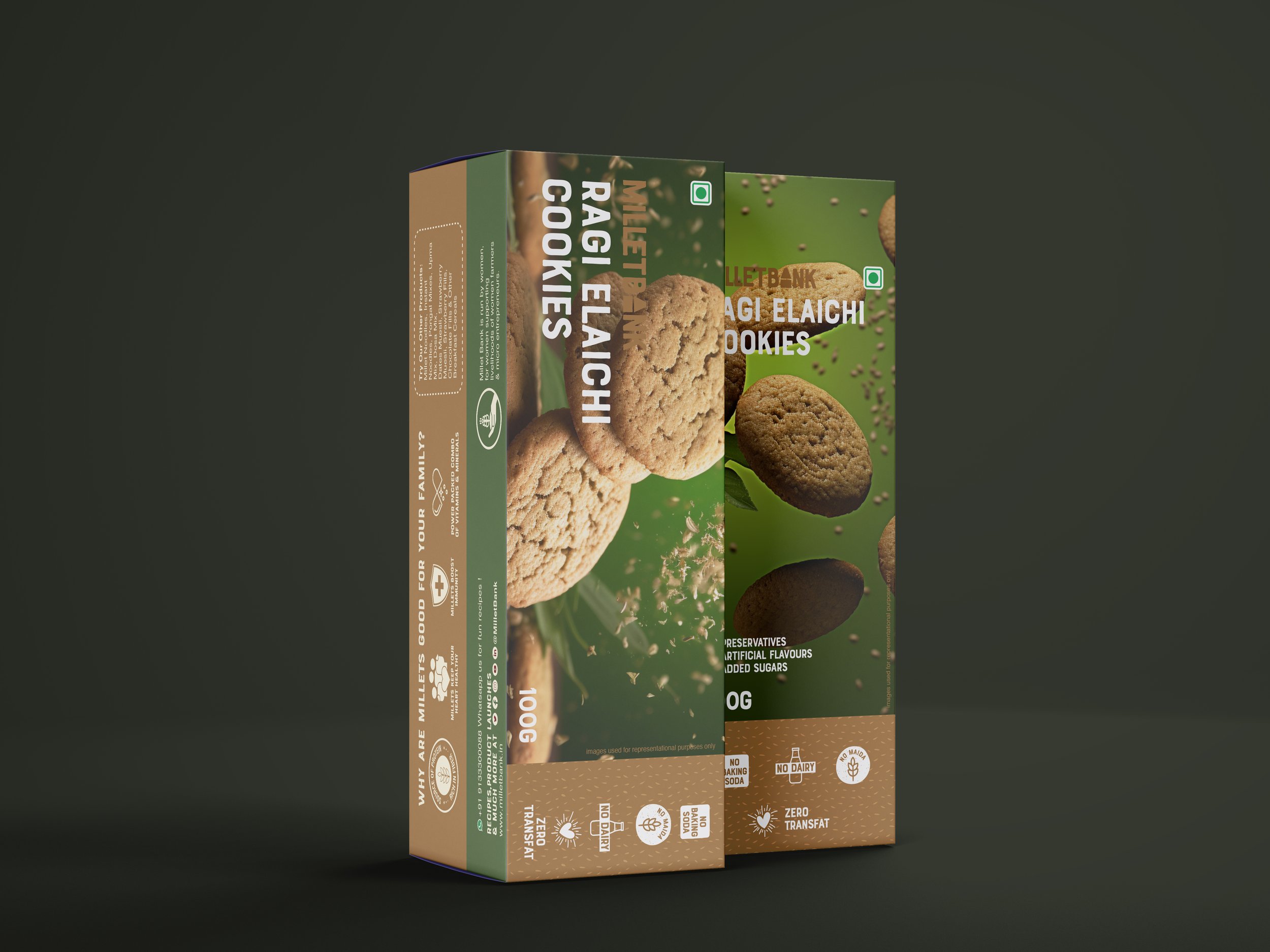
Millet bank is run by women for women, supporting livelihoods of women farmers & micro entrepreneurs.


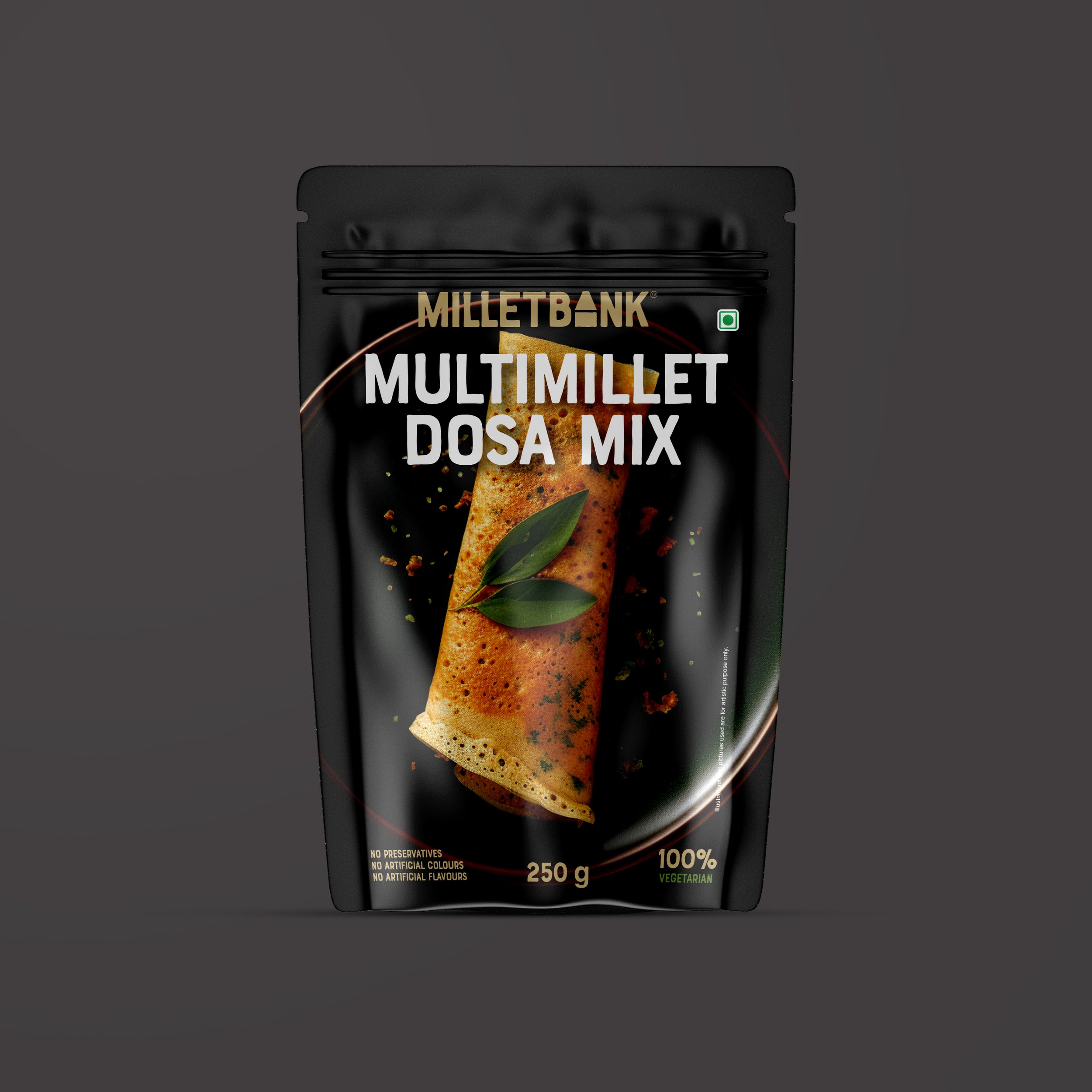
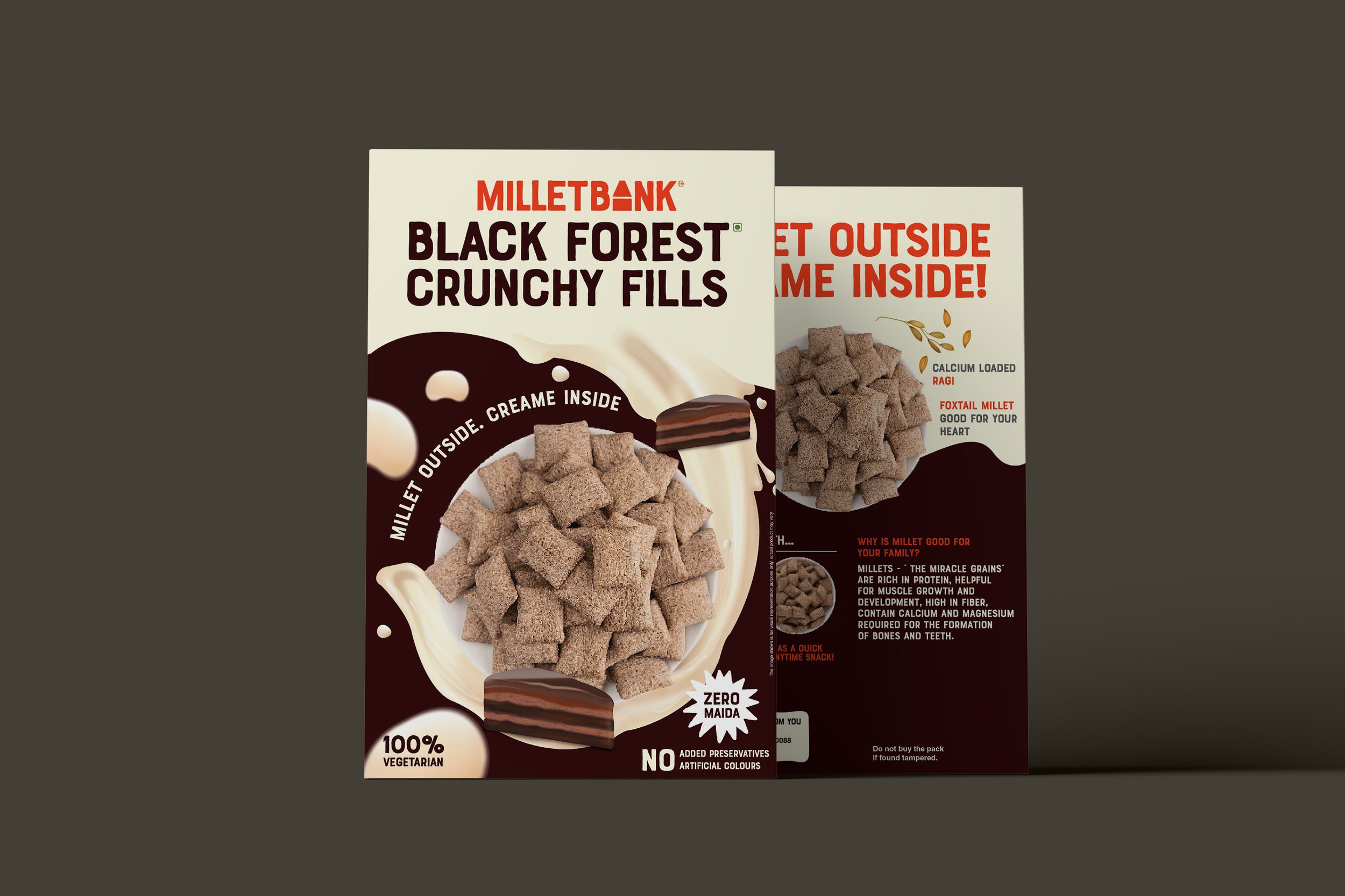
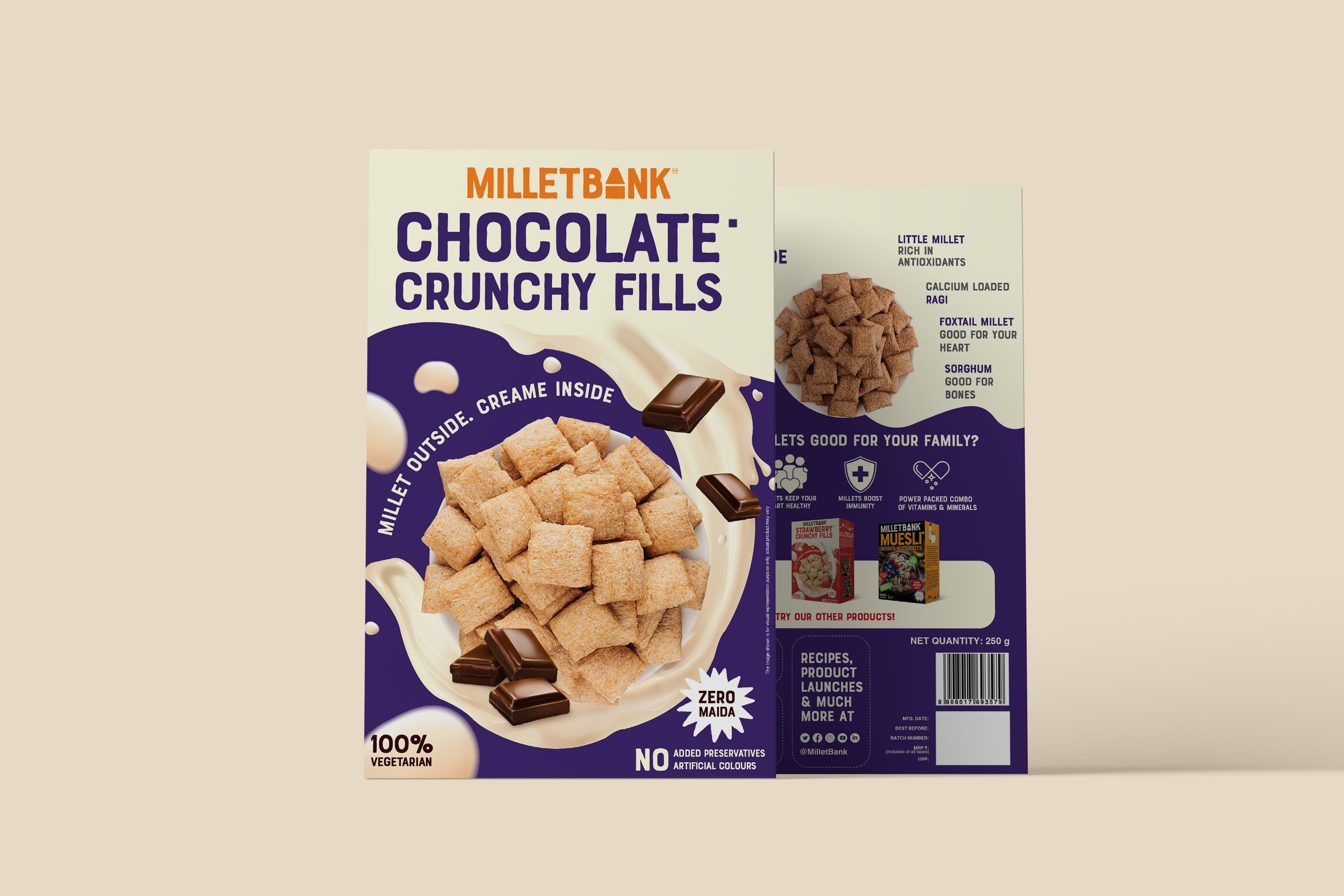
We developed an integrated identity system that uses bold typography and colours to create a packaging style that stands out in a crowded retail space. As one of the key proponents of millets in India, the products today cover a diverse range - from breakfast mixes to snacks.